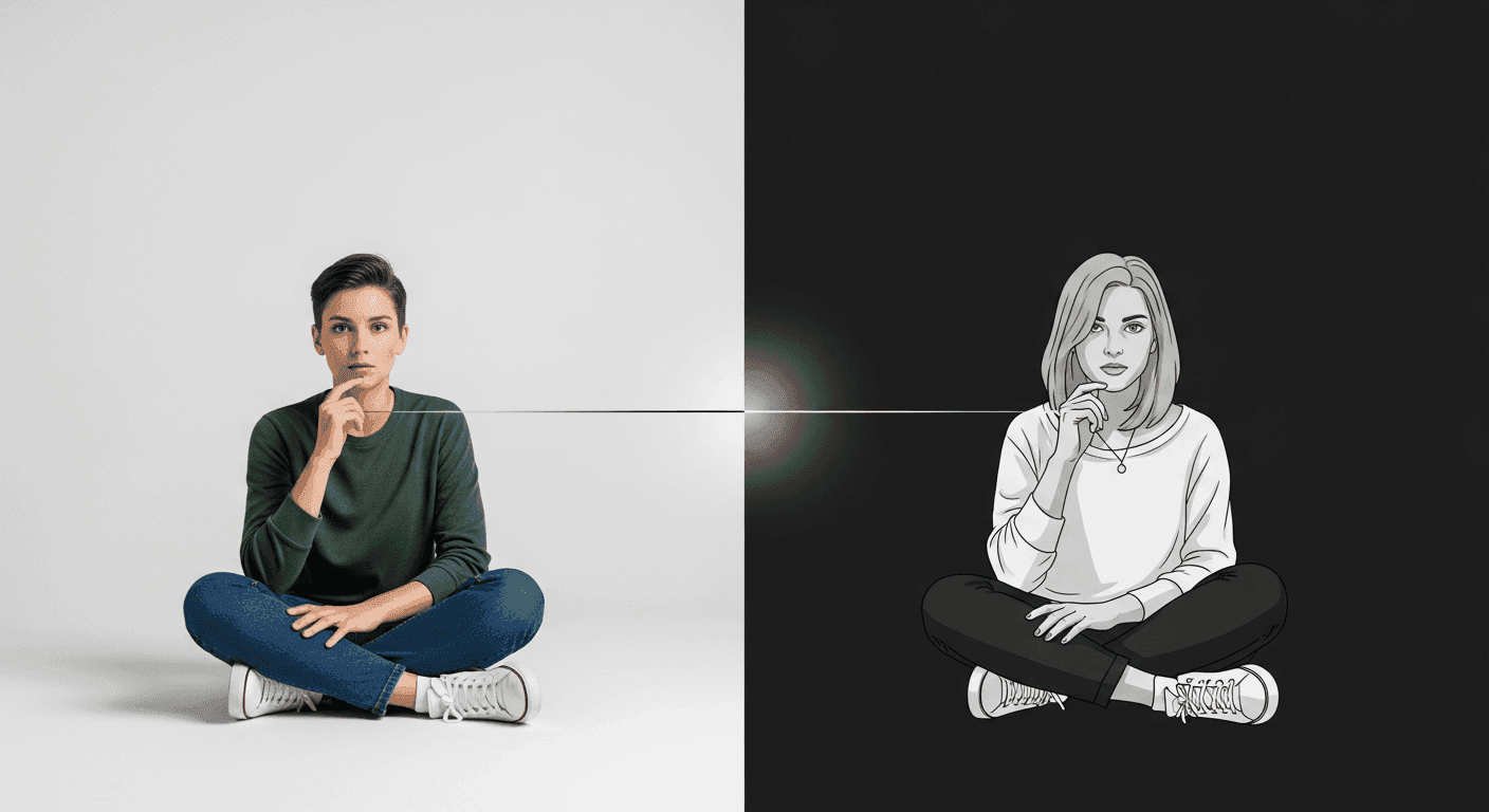
Dark mode has transitioned from a niche preference to a mainstream feature, embraced by users for its aesthetic appeal, reduced eye strain in low-light environments, and potential battery savings on OLED screens. For designers, this shift presents both an opportunity and a challenge. While text and UI elements can often be inverted or adjusted relatively straightforwardly, visual assets like photography and illustrations require a more nuanced approach.
Simply inverting colors or slightly dimming an image designed for a light interface can lead to jarring visuals, lost detail, or a completely altered brand mood. This article will guide you through practical strategies for adapting your visual content, ensuring your photography and illustrations not only survive but thrive in dark mode, maintaining consistency and delivering an optimal user experience.
The Unique Challenges of Dark Mode Visuals
The fundamental difference between light and dark interfaces lies in their primary luminance. Light mode relies on dark text on a light background, while dark mode uses light text on a dark background. Photography and illustrations created for light mode often feature bright backgrounds, high contrast, and vibrant colors that pop against white. When these same assets are placed on a dark canvas, they can appear overly bright, create unwanted halos, or clash with the interface's subdued palette, leading to visual discomfort or a disjointed aesthetic.
Another significant challenge is maintaining brand identity and emotional resonance. A bright, airy photograph might convey joy and optimism in light mode, but the same image, without careful adaptation, could feel out of place or even unsettling on a dark background. Designers must consider how the visual mood and message are perceived in both contexts, ensuring consistency without compromising the user experience.
Strategies for Photography in Dark Mode
Adapting photographs for dark mode is less about a complete overhaul and more about strategic adjustments to light, contrast, and color. The goal is to reduce the image's overall luminance while retaining detail and visual interest. Pure whites should be softened to off-white or light gray tones, and harsh shadows might need to be lifted slightly to prevent them from merging indistinguishably with the dark background.
Consider a slight desaturation or a shift in color temperature. Warmer tones can sometimes feel too intense on a dark background, while cooler, more muted tones might integrate more seamlessly. However, avoid over-desaturation, which can make images look flat or lifeless. Selective color emphasis can also be effective, allowing key elements to retain their vibrancy while the rest of the image is toned down.
- Reduce overall brightness and exposure to prevent glaring.
- Soften harsh highlights and deep shadows to reveal detail.
- Adjust color temperature, often preferring slightly cooler or neutral tones.
- Apply subtle, transparent overlays or gradients to blend with the dark background.
- Test images on various devices and screen types to ensure legibility and impact.
- Avoid pure black backgrounds within photos, as they can merge with the UI.
Adapting Illustrations for Dark Mode
Illustrations, by their nature, offer designers greater control over individual elements, making their adaptation for dark mode potentially more straightforward than photography. Unlike photos, illustrations are often composed of distinct shapes and colors, allowing for precise adjustments to each component. The key is to think of dark mode as an entirely different canvas, not just an inversion.
Start by identifying the primary colors in your illustration. For elements that are meant to appear 'light' or 'foreground' in light mode, consider shifting them to slightly darker, but still distinct, light grays or muted pastels. Background elements that were previously light should be swapped for appropriate dark colors from your dark mode palette. Outlines can also play a crucial role, providing definition to shapes that might otherwise get lost against a dark backdrop.
Color Palette Adjustments for Illustrations
A dedicated dark mode color palette is essential for illustrations. This isn't just about making colors darker; it's about re-evaluating their relationships and ensuring sufficient contrast for accessibility without causing eye strain. Remember that colors often appear more vibrant and saturated on a dark background, so you might need to slightly desaturate your hues for dark mode.
- Swap light background colors for dark, often desaturated, alternatives.
- Lighten foreground elements and text within the illustration (but avoid pure white).
- Use vibrant accent colors sparingly to draw attention, not overwhelm.
- Ensure sufficient contrast between all elements and the background, meeting accessibility standards.
- Consider the semantic meaning of colors and how they translate to a darker context.
- Utilize subtle gradients or textures to add depth without relying on harsh shadows.
Consistency and Context: Beyond the Visuals
While adapting individual assets is crucial, the broader goal is to maintain a consistent brand identity and user experience across both light and dark modes. This means ensuring that the overall mood, tone, and message conveyed by your visuals remain cohesive. A user switching between modes should feel like they are interacting with the same product, just presented in a different aesthetic.
Beyond visual adjustments, consider the context in which your visuals appear. Does an image communicate effectively when surrounded by dark UI elements? Does an illustration still convey its intended meaning? User testing with both light and dark mode users is invaluable here, providing real-world feedback on readability, comfort, and emotional impact. Iterate based on these insights to fine-tune your visual adaptations.
Implementing Dark Mode Visuals in Your Design System
To ensure scalability and consistency, integrate your dark mode visual guidelines directly into your design system. Document specific rules for photography treatment, illustration color palettes, and asset export specifications for both themes. This proactive approach empowers designers and developers to implement dark mode visuals efficiently and accurately across all product surfaces.
Ultimately, adapting photography and illustrations for dark mode is an act of empathy. It's about designing for a diverse range of user preferences and environmental conditions. By thoughtfully adjusting your visual assets, you enhance accessibility, reduce visual fatigue, and deliver a more polished, premium experience for all users.
Sources & Further Reading
- prefers-color-scheme: Hello darkness, my old friend — web.dev
- The Ultimate Guide to Color in UI Design — Interaction Design Foundation
- prefers-color-scheme — MDN Web Docs
- Visual design — Wikipedia