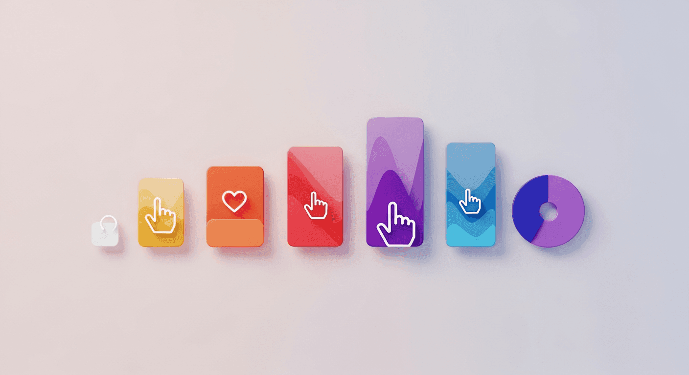
In the intricate world of user interface design, every element serves a purpose, guiding users through their digital journey. Among the most powerful yet often subconsciously processed tools at a designer's disposal is color. More than just aesthetics, color plays a critical role in communicating affordance – the perceived qualities of an object that suggest how it can be used. When color is leveraged effectively, it transforms an interface from a collection of static visuals into an intuitive, interactive experience.
Understanding how to harness color for affordance means moving beyond mere decoration. It involves a strategic application of hue, saturation, and contrast to signal interactivity, differentiate elements, and provide immediate feedback. For designers and product professionals, mastering this aspect ensures that users effortlessly grasp how to interact with an interface, reducing cognitive load and fostering a sense of control and predictability.
What is Affordance in UI Design?
At its core, affordance refers to the inherent properties of an object that imply its possible uses. Think of a door handle: its shape and placement inherently suggest pushing or pulling. In the digital realm, UI affordances are the visual cues that tell a user what they can do with an interface element. A button's rectangular shape and subtle shadow afford clicking; a text field's empty space and blinking cursor afford typing. When these cues are clear, users don't need instructions; they simply know how to interact.
Color is a primary visual cue for digital affordance. It can instantly draw attention, indicate status, or suggest an action. An interactive element that is brightly colored might signal importance or availability, while a desaturated element might communicate that it's inactive or disabled. The goal is to make the interface's possibilities immediately perceivable, reducing the need for trial-and-error and enhancing usability.
The Psychology of Color and Interaction
Our brains are hardwired to interpret color, often associating specific hues with particular meanings or actions. These associations can be universal, cultural, or learned through convention. For instance, red often signifies caution or an error, green suggests success or a positive action, and blue has become the widely accepted convention for clickable links on the web. Designers can tap into these established psychological and conventional meanings to reinforce affordance.
By aligning color choices with users' pre-existing mental models, we can create interfaces that feel intuitive and natural. When a primary call-to-action button uses a vibrant, brand-specific color, it leverages both visual prominence and brand association to communicate its interactive purpose. Conversely, using a neutral or muted color for a purely informational element helps distinguish it from actionable components, preventing user confusion.
Communicating Interactivity Through Hue and Saturation
Hue (the pure color itself, like red or blue) and saturation (the intensity or purity of the color) are powerful attributes for signaling interactivity. A common pattern is to use higher saturation and brighter hues for active or primary interactive elements, making them stand out and clearly inviting interaction. For disabled or secondary actions, desaturated or lighter colors are often employed, indicating a lower priority or temporary unavailability.
Consider a form submission button: when it's ready to be clicked, it might glow with a vibrant brand color. Once submitted, it might briefly change to a shade of green to indicate success, or if a required field is incomplete, it might momentarily flash red. These subtle shifts in hue and saturation provide immediate, clear feedback about the system's state and the user's interaction, enhancing the perceived affordance of the element.
- Use distinct hues for different interaction types, such as primary buttons, destructive actions, or informational links.
- Increase saturation and brightness for interactive elements to make them visually prominent and inviting.
- Desaturate or lighten colors for disabled, non-interactive, or lower-priority elements to differentiate them.
- Leverage brand primary colors for key actionable elements to reinforce identity and clearly signal interactivity.
- Maintain consistent color mappings across the entire interface; a color used for a button should not be used for static text.
- Avoid relying solely on color to convey critical meaning; always include secondary indicators for accessibility.
The Role of Contrast and Accessibility
Contrast is paramount when using color for affordance, particularly for accessibility. High contrast between an interactive element and its background ensures that it is visible and distinguishable for all users, including those with visual impairments. If a button's text or icon blends too closely with its background color, its affordance is diminished, making it difficult for users to perceive it as interactive.
Adhering to accessibility guidelines, such as WCAG (Web Content Accessibility Guidelines) for color contrast ratios, is not just about compliance; it's about creating inclusive designs where color effectively communicates affordance to everyone. When interactive elements like links or buttons meet sufficient contrast, their clickable nature is inherently clearer, reinforcing their affordance and improving overall usability.
Beyond Buttons: Color for State and Feedback
Color's role in affordance extends beyond merely signaling a clickable area; it is crucial for communicating state changes and providing immediate feedback. Hover states, focus states, selected states, and error messages all rely heavily on color to inform the user about the element's current condition or the outcome of their action. A navigation item changing color upon selection, or a form field's border turning red when invalid, are classic examples of color conveying dynamic affordances.
Effective use of color in these instances provides a clear and instant understanding of what is happening in the interface. This real-time feedback loop is essential for building trust and confidence, as users feel informed and in control. Without these color-driven cues, users might feel lost or uncertain about whether their actions were registered or what the next step should be.
Leveraging color for affordance is a fundamental skill for any UI designer. It involves a thoughtful blend of psychological understanding, established conventions, and a keen eye for visual hierarchy. By intentionally choosing hues, saturations, and contrasts to signal interactivity, designers can create interfaces that are not only aesthetically pleasing but also profoundly intuitive and accessible. When color tells the story of interaction, users navigate with ease, making the digital experience seamless and satisfying.
Sources & Further Reading
- What are Affordances? — Interaction Design Foundation
- Color Theory for Designers: A Complete Guide — Interaction Design Foundation
- Affordance — Wikipedia
- Color theory — Wikipedia