In the vast and ever-evolving landscape of digital products, a strong visual language is more than just a pretty face; it’s the silent storyteller, the brand ambassador, and the intuitive guide that shapes every user interaction. Imagine a conversation without tone or expression – that's a product lacking a coherent visual language. It’s the carefully chosen typefaces, the evocative power of imagery, and the harmonious interplay between them that transforms an ordinary interface into an extraordinary experience, fostering trust, recognition, and emotional connection with your audience. This isn't merely about aesthetics; it's about strategic communication at a glance.
For designers and product people, understanding how to intentionally craft this language is a fundamental skill. It’s the difference between a product that feels generic and one that feels uniquely 'on brand,' effortlessly guiding users while subtly reinforcing its identity. This article will dive deep into the twin pillars of visual language – typography and imagery – exploring how to select, refine, and combine them to build a cohesive, compelling, and ultimately useful experience that resonates with your users long after their first interaction. Let's unpack the elements that define a truly impactful visual voice.
The Foundation: What is a Visual Language?
Before we delve into the specifics, let's establish a clear understanding of what a visual language truly entails. At its core, a visual language is a systematic set of principles and elements that dictate how a brand or product looks and feels across all touchpoints. It encompasses everything from color palettes and iconography to spacing and motion, but none are as profoundly impactful or as foundational as typography and imagery. These elements carry the heaviest load in conveying personality, mood, and information hierarchy.
A well-defined visual language goes beyond superficial styling; it’s a strategic asset. It ensures consistency, reduces cognitive load for users (they learn what to expect), and builds brand equity over time. When every button, every header, and every image speaks the same language, users feel more confident, understand information more quickly, and develop a stronger sense of familiarity and trust with your product. Conversely, a fractured or inconsistent visual language can lead to confusion, undermine credibility, and create a disjointed, frustrating user experience.
Typography: The Voice of Your Brand
Typography is arguably the most crucial component of any digital interface. It's not just about selecting pretty fonts; it's about readability, hierarchy, and conveying an underlying tone. The typefaces you choose and how you apply them determine how easily users can consume information and, crucially, the emotional resonance of your content. A playful sans-serif communicates differently than a classic serif, and a robust display font asserts authority in a way a delicate script cannot.
When choosing typefaces, consider your brand's personality and the message you want to convey. Are you modern and minimalist? Established and trustworthy? Playful and innovative? Limit your palette to one or two primary typefaces (one for headings, one for body text, perhaps a third for specific accents) to maintain coherence. Overuse of different fonts can quickly lead to visual clutter and a fragmented identity. Remember that a typeface’s legibility and readability across various screen sizes and resolutions must always take precedence over purely aesthetic appeal.
Establishing Typographic Hierarchy
Effective typography is all about creating a clear visual hierarchy that guides the user's eye through the content. This hierarchy is built using variations in size, weight, color, and spacing. Headings (H1, H2, H3) should clearly stand out from body text, and call-to-action elements should demand attention. A well-defined type scale ensures that these relationships are consistent and harmonious across your entire product. Start with a base font size for body text (e.g., 16px) and build your scale multiplicatively (e.g., using a 1.25 ratio) for headings and smaller text.
Beyond size and weight, consider contrast. Dark text on a light background (or vice-versa) is generally optimal for readability. Ensure sufficient contrast ratios (WCAG guidelines recommend 4.5:1 for normal text) for accessibility. Color can also be used subtly to denote different types of information, but always ensure it doesn't compromise readability. Consistency in these choices forms the backbone of a robust typographic system.
Mastering Typographic Details
The devil, as they say, is in the details. Line height (leading), letter spacing (kerning and tracking), and paragraph spacing are critical for comfortable reading. Too tight, and text feels cramped; too loose, and it loses cohesion. A good rule of thumb for line height is 1.4-1.6 times the font size for body text. Adjust letter spacing subtly for larger headlines to prevent awkward gaps, and for smaller text to ensure legibility. Paragraph spacing should be distinct enough to separate blocks of text but not so large that it breaks the flow of reading.
- **Select Purposefully:** Choose typefaces that embody your brand's personality and are highly legible.
- **Limit Your Palette:** Stick to 1-3 font families to maintain consistency and avoid visual chaos.
- **Define a Scale:** Establish a systematic type scale for headings, body, and auxiliary text (e.g., 16px base, 1.25x ratio).
- **Prioritize Readability:** Ensure adequate contrast, line height (1.4-1.6x font size), and comfortable letter spacing.
- **Check Accessibility:** Verify WCAG compliance for contrast ratios and responsive sizing across devices.
- **Test on Real Devices:** Always review your typography on actual screens to catch rendering issues and refine details.
Imagery: Evoking Emotion and Understanding
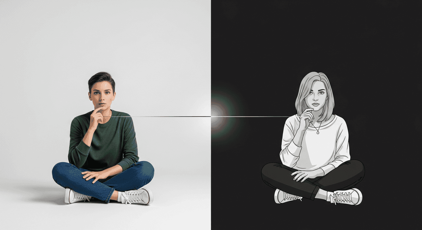
While typography communicates directly through words, imagery speaks volumes through emotion, context, and visual metaphor. Whether it's photography, illustrations, icons, or videos, imagery has the power to instantly convey mood, reinforce messages, and break up dense blocks of text, making content more engaging and digestible. The right image can clarify complex ideas, celebrate user success, or add a touch of humanity to an otherwise functional interface.
Just like typography, imagery must be consistent in style, tone, and quality. A mix of highly polished professional photography with cartoonish illustrations will create a jarring, unprofessional experience. Decide on an overarching visual style for your imagery – realistic, abstract, geometric, hand-drawn – and stick to it. This consistency is paramount for building a recognizable and trustworthy brand identity.
Curating Your Image Library
Sourcing imagery requires careful consideration. High-quality stock photos can be a good starting point, but bespoke photography or illustrations often offer a more unique and authentic brand representation. When using stock, carefully curate images that feel genuine and align with your brand's aesthetic; avoid anything overly generic or staged. Always pay attention to licensing agreements to ensure legal compliance. Consider the cultural context of your audience when selecting visuals to ensure inclusivity and avoid misinterpretations.
The choice between photography and illustration also impacts your brand's voice. Photography often lends a sense of realism, authenticity, and directness, ideal for products that emphasize trust or human connection. Illustrations, on the other hand, can offer a more conceptual, playful, or abstract feel, allowing for greater creative freedom and the ability to simplify complex ideas without losing clarity. Icons, small but mighty, serve as universal visual cues that enhance navigation and understanding, but must also adhere to a consistent style (line, filled, glyph, etc.).
Visual Storytelling through Imagery
Beyond mere decoration, imagery should tell a story or serve a functional purpose. Consider the composition, subject matter, and emotional impact of each image. Does it support the surrounding text? Does it add value or merely fill space? Smart cropping can dramatically alter the focus and impact of an image, drawing attention to key elements. Always optimize images for web performance to ensure fast loading times, as heavy images can significantly degrade user experience, regardless of their aesthetic appeal.
- **Define a Style:** Establish a clear visual style (realistic, abstract, illustrative) for all imagery to ensure brand consistency.
- **Source Ethically & Legally:** Use licensed stock, create original assets, or understand usage rights for free resources.
- **Prioritize Relevance:** Every image should serve a purpose, support content, or evoke a desired emotion; avoid 'filler' visuals.
- **Ensure Quality & Optimization:** Use high-resolution images, but compress them properly for fast loading without visual degradation (e.g., WebP, optimized JPEGs).
- **Maintain Consistency:** Apply consistent color grading, artistic style, and subject matter across your entire image library.
- **Consider Accessibility:** Use alt text for all meaningful images, and ensure images don't rely solely on color to convey information.
The Synergistic Dance: Typography and Imagery in Harmony
The true magic of a compelling visual language emerges when typography and imagery work together in perfect harmony. They are not separate entities but rather two instruments in a larger orchestra, each playing its part to create a unified symphony. A strong headline paired with a complementary hero image can instantly communicate your value proposition. Conversely, mismatched type and imagery can create dissonance, making your product feel disjointed and confusing.
Consider how your typeface's personality aligns with the mood of your imagery. A sophisticated serif might pair well with elegant, minimalist photography, while a bold, geometric sans-serif could complement vibrant, abstract illustrations. Use white space strategically to give both text and images room to breathe, preventing a cramped or overwhelming layout. The interplay of text size and image scale also dictates visual weight; a large, impactful image might be balanced by concise, bold text, while a busy image might require simpler, more understated typography.
Effective layout design is the stage where this dance unfolds. Grid systems, alignment, and proximity principles ensure that text blocks and images are not just placed on a page but are intentionally organized to create clear relationships and a natural flow. When typography and imagery are thoughtfully integrated, they amplify each other’s strengths, creating a visual narrative that is both aesthetically pleasing and highly functional.
Building a Cohesive System: From Guidelines to Implementation
Crafting a compelling visual language isn't a one-off design task; it's an ongoing process that benefits immensely from systematization. This means moving beyond ad-hoc design decisions to establish clear guidelines, design tokens, and potentially a full-fledged design system. Documenting your typographic scale, usage rules for different heading levels, specific font weights, and approved imagery styles (e.g., color saturation, photographic filters, illustration styles) ensures consistency across all design and development efforts.
Design tokens (e.g., `font-size-h1`, `color-primary-text`, `image-border-radius`) are invaluable for translating design decisions into development-ready variables. They create a single source of truth, making it easier to maintain consistency and implement changes globally. A style guide or design system should clearly articulate *why* certain choices were made, providing context and examples of both correct and incorrect usage. This empowers your entire team – designers, developers, marketers – to contribute to and uphold the visual language effectively.
Regular audits of your product's visual elements against these guidelines are crucial. As products evolve and new features are added, there's always a risk of visual drift. Proactive governance and a culture of adherence to the visual language documentation will prevent inconsistencies from creeping in and ensure your product maintains its strong, unified identity over time.
Iteration and Evolution: Keeping Your Visual Language Alive
A visual language, much like a living organism, is not static. It should evolve with your brand, your users, and the technological landscape. Don't be afraid to iterate and refine your choices based on user feedback, analytics, and broader market trends. Perhaps a particular typeface isn't performing well in user testing for readability, or your imagery style is starting to feel dated. These are opportunities for growth, not failures.
Conduct A/B tests on different typographic styles or image treatments to see what resonates most with your audience. Gather qualitative feedback through user interviews and usability tests to understand how your visual language is perceived. Does it feel trustworthy, modern, or friendly? Does it communicate the intended message? A visual language that is responsive to feedback and adaptable to change is one that will remain compelling and effective for the long haul.
Key Takeaways for Crafting Your Visual Language
Building a compelling visual language is an art and a science, demanding both creative vision and systematic thinking. It's about making intentional choices that resonate with your brand's core identity and serve your users' needs. By meticulously curating your typography and imagery, ensuring their harmonious interplay, and documenting your decisions within a robust design system, you can elevate your product from merely functional to truly unforgettable. Embrace consistency, prioritize clarity, and remember that every visual element contributes to the story you tell.
Sources & Further Reading
- Visual Design Principles and Elements — Interaction Design Foundation
- Visual communication — Wikipedia
- font — MDN Web Docs