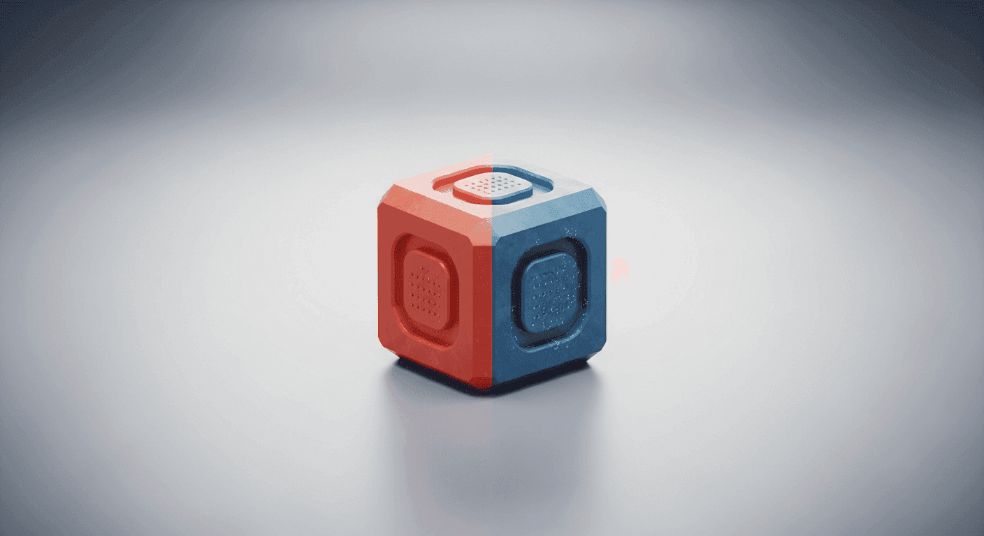
In the world of UX/UI design, reusable components are the bedrock of efficiency, consistency, and scalability. From buttons and input fields to cards and navigation elements, these building blocks allow teams to construct complex interfaces with speed and precision. However, relying solely on a single, rigid version of each component can quickly lead to design limitations, forcing designers to create custom solutions outside the system or sacrifice visual nuance where it's needed most.
This is where the concept of visual variants becomes indispensable. Instead of simply duplicating components or creating one-off exceptions, variants provide a structured way to introduce controlled flexibility. They allow a single component to adapt its appearance to different contexts, states, or themes, all while maintaining its core identity and reusability. Mastering the craft of designing these variants is crucial for any designer or product person aiming to build robust, adaptable, and aesthetically cohesive digital experiences.
Understanding the 'Variant' in Design Systems
At its heart, a visual variant is an alternative aesthetic presentation of a component that shares the same underlying structure and functionality. Think of a button: while its fundamental purpose is to trigger an action, it might need to appear as a primary call-to-action, a secondary option, a destructive warning, or even a ghost button, each with distinct visual characteristics like color, border, and text styling. These different appearances are its variants.
Without variants, designers often resort to creating entirely new components for each minor visual difference. This leads to an explosion of individual assets that are difficult to manage, update, and keep consistent. A design system with well-defined variants, on the other hand, allows a single 'button' component to fulfill numerous design requirements through a set of predefined, easily selectable options, significantly reducing design debt and improving workflow efficiency.
The Core Principles of Variant Design
Designing effective variants isn't just about making things look different; it's about making them different with purpose and control. The primary goal is to provide necessary flexibility without introducing chaos or undermining the system's overall consistency. Every variant should serve a clear use case and integrate seamlessly into the broader design language.
Striking the right balance requires adherence to a few core principles:
- Clarity of Purpose: Each variant must have a distinct, documented reason for its existence, addressing a specific user need or design context.
- Consistency within Variation: While they differ visually, variants of the same component should retain shared characteristics, ensuring they are still recognizable as part of the same family.
- Scalability: Design variants in a way that allows for future additions without breaking the existing system or creating redundant work.
- Accessibility: Ensure that all visual variants meet accessibility standards, including sufficient color contrast and clear focus states.
- Maintainability: Variants should be easy to update. Changes to underlying design tokens (like color palettes or typography scales) should propagate correctly across all relevant variants.
- Documentation: Clearly define and illustrate each variant's appearance, usage guidelines, and intended context for both designers and developers.
Common Types of Visual Variants
Variants typically categorize visual differences based on common design needs. Understanding these categories helps structure your component properties and ensures comprehensive coverage:
Common variant types include:
- Size: Components often need to appear in different dimensions. A button might have 'small', 'medium', and 'large' variants. An avatar could be 'extra-small', 'small', 'medium', or 'large'.
- State: Interactive components exist in various states. A button, for instance, typically has 'default', 'hover', 'active', 'focus', 'disabled', and 'loading' states. Input fields might have 'error' or 'success' states.
- Theme/Context: Components can adapt to different visual themes or hierarchical importance. A button might be 'primary', 'secondary', 'tertiary', 'outline', or 'destructive'. In a dark mode theme, components would have corresponding 'dark' variants.
- Content Configuration: Sometimes, variants are based on the presence or absence of certain content elements. A button might have variants for 'text-only', 'icon-only', or 'icon-and-text'. A card component might have variants for 'with-image', 'without-image', or 'with-actions'.
Designing for Variant Flexibility (Without Chaos)
The key to successful variant design lies in defining the right parameters and leveraging design tokens. Instead of creating bespoke styles for every single variant, aim to build a system where variants are composed of shared, underlying attributes.
In design tools, this translates to using component properties or smart variants that allow you to toggle options (e.g., 'size: medium', 'state: disabled', 'icon: true'). In code, this corresponds to component props that accept predefined values. For example, a button component might accept `variant="primary"`, `size="large"`, and `state="disabled"` as props.
Crucially, centralize your visual attributes through design tokens. Colors, spacing, typography, border radii, and shadows should all be defined as tokens. This way, when you define a 'primary' button variant, you're not hardcoding a hex value, but referencing a `color-brand-primary` token. This ensures that if your brand primary color changes, all components using that token update automatically, maintaining consistency across all variants and components effortlessly.
Documenting and Communicating Variants
Even the most thoughtfully designed variants are ineffective if they aren't clearly documented and communicated. Your design system's documentation should be the single source of truth for all component variants, serving as a guide for both designers and developers.
For each component, provide clear visual examples of every variant. Detail its purpose, when to use it, and, perhaps more importantly, when NOT to use it. Include specifications for all states, sizes, and thematic options. Documenting prop names for developers ensures seamless implementation and reduces guesswork, fostering a strong design-developer handoff.
Effective documentation fosters adoption, minimizes misuse, and ensures that the design system remains a living, accessible resource. It empowers teams to build consistent, high-quality interfaces by providing clear guardrails and examples for every visual component need.
Iteration and Evolution
Design systems are not static; they evolve with the product and user needs. Visual variants, too, will require iteration and refinement over time. Be prepared to review existing variants, deprecate those that are no longer necessary, and introduce new ones as design requirements shift.
Gather feedback from designers, developers, and even users to understand how variants are being utilized and if they effectively address diverse use cases. Regular audits and a collaborative approach ensure that your component variants remain relevant, robust, and continue to serve as a powerful asset in your design and development workflow.
Sources & Further Reading
- Design Systems 101 — Nielsen Norman Group
- Web Components — MDN Web Docs
- A Complete Guide to Custom Properties — CSS-Tricks
- Using CSS custom properties — MDN Web Docs
- Scalability — Interaction Design Foundation