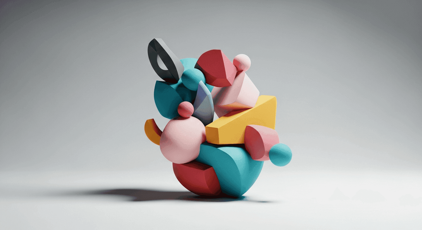
In the complex world of user interface design, guiding a user's attention is paramount. It's not enough for elements to simply exist on a screen; they must communicate their relative importance. This is where the concept of visual weight comes into play, an often-underestimated tool that subtly yet powerfully dictates how users perceive and interact with your design.
Visual weight refers to the perceived 'heaviness' or prominence of an element within a layout. Just as in the physical world where larger objects feel heavier, certain design attributes make elements feel more substantial, drawing the eye first. Mastering visual weight is about intentionally manipulating these attributes to create a clear visual hierarchy, ensuring that critical information and actions are immediately discoverable and understandable.
What is Visual Weight?
At its core, visual weight is about making certain elements stand out more than others. Think of it as a subconscious ranking system for every item on your screen. The elements with higher visual weight demand attention first, while those with lower weight recede into the background, supporting the primary focus. This isn't just about aesthetics; it's about usability. A well-orchestrated visual hierarchy reduces cognitive load, helps users scan interfaces efficiently, and ultimately leads them to their goals with less effort.
Without a clear visual hierarchy, interfaces become chaotic and overwhelming. Users struggle to differentiate between primary and secondary information, leading to frustration and potential abandonment. By understanding and applying the principles of visual weight, designers can craft intuitive experiences that feel natural and effortless.
Size: The Obvious Leader
The most straightforward way to establish visual weight is through size. Larger elements naturally possess more visual weight than smaller ones. A prominent headline immediately signals its importance compared to a body paragraph. A primary call-to-action (CTA) button that is larger than auxiliary links will invariably draw the eye first.
However, using size effectively isn't just about making things big. It's about creating a harmonious scale. A thoughtful scaling system, often derived from a base unit, ensures that size differences are meaningful and consistent, guiding the user's eye in a logical progression rather than creating a jumbled mess.
Color & Contrast: Grabbing Attention
Color is a powerful tool for manipulating visual weight. Saturated, vibrant colors tend to have more visual weight than desaturated or muted tones. Warm colors (reds, oranges, yellows) often feel like they advance toward the viewer, giving them more prominence, while cool colors (blues, greens, purples) tend to recede. High contrast elements also demand attention, making them feel heavier than elements with low contrast.
Contrast isn't limited to color; it also applies to value (lightness or darkness). Dark text on a light background, or vice-versa, creates strong contrast, making the text highly readable and visually weighty. Conversely, subtle variations in shade or hue can be used for secondary information that doesn't require immediate focus.
- Primary CTA buttons often utilize a brand's accent color for maximum visual weight.
- Error messages commonly use red to immediately signal urgency and importance.
- Inactive or disabled elements are frequently desaturated or lightened to reduce their visual weight.
- Key information within a paragraph can be bolded or given a contrasting color to highlight it.
- Hover states often increase an element's contrast or brightness to draw attention to interactivity.
Spacing & Proximity: Defining Relationships
The amount of empty space (whitespace or negative space) surrounding an element significantly impacts its visual weight. An element isolated by ample whitespace will appear more prominent and important than one crowded by other elements. This isolation draws the eye, making the element feel more substantial and deliberate.
Conversely, the principle of proximity dictates that elements placed close together are perceived as a group. These groups then collectively possess their own visual weight. Thoughtful spacing helps define these relationships, allowing users to quickly scan and understand the structure of the content without conscious effort.
Texture & Depth: Adding Dimension
Elements that appear to have texture or depth can also gain visual weight. A raised button with a subtle shadow, for instance, feels more tangible and interactive than a flat, borderless rectangle. This sense of dimensionality makes the element feel like it's closer to the viewer or has a more significant physical presence.
Techniques like gradients, drop shadows, and subtle bevels can create this illusion of depth. While modern design often favors a flatter aesthetic, carefully applied depth effects can still be used to highlight interactive elements or important content containers, giving them a subtle boost in visual weight without being overly skeuomorphic.
Typography: Beyond Just Words
Typography is more than just selecting a font; it's a powerful lever for visual weight. Font weight (boldness), font style (italic), and font case (ALL CAPS) all contribute significantly. Bolder, heavier typefaces naturally command more attention than lighter ones. All-caps text, when used sparingly, can also increase visual weight, though overuse can hinder readability. Similarly, a larger font size is the most direct way to increase the visual weight of text.
Beyond the individual character, the overall density of a text block also plays a role. Tighter line height and letter spacing can make a block of text feel denser and heavier, while more generous spacing makes it feel lighter and airier. By combining these typographic elements, designers can create a rich hierarchy that guides the eye through textual content with ease.
Putting It All Together: Orchestrating Hierarchy
It's rare for visual weight elements to act in isolation. The true mastery of visual hierarchy comes from understanding how size, color, contrast, spacing, texture, and typography work together in concert. A large, bold, brightly colored button isolated by whitespace will have exponentially more visual weight than if only one of those attributes were applied.
Good design is about the intentional orchestration of these elements to create a clear, intuitive path for the user's eye. It's about ensuring that the most important information or interaction points are immediately identifiable, while secondary elements appropriately support them without competing for attention. This deliberate manipulation of visual weight reduces cognitive load, streamlines user flows, and ultimately enhances the overall user experience.
By deconstructing visual weight into its fundamental components, designers gain a powerful toolkit for crafting interfaces that are not only aesthetically pleasing but also highly functional and user-centric. Mastering these elements is a critical step towards creating truly intuitive and effective digital products.
Sources & Further Reading
- Typography — Wikipedia
- The Power of Whitespace in Web Design — Interaction Design Foundation
- Color Theory for Designers: The Meaning of Color — Interaction Design Foundation
- Gestalt principles — Wikipedia
- font-size — MDN Web Docs