Dark mode has transitioned from a niche preference to a mainstream staple in user interface design, offering aesthetic appeal, reduced eye strain in low-light environments, and potential battery savings. However, while its benefits are clear, designing effective dark mode interfaces presents unique challenges, particularly when it comes to establishing visual hierarchy and depth. What once worked effortlessly in light mode – relying on shadows to convey elevation – often falls flat on dark backgrounds.
This is where the concept of visual elevation becomes paramount. In light mode, objects appear to "lift" off a surface by casting shadows beneath them. In dark mode, this metaphor needs a sophisticated reinterpretation. Visual elevation is the deliberate use of design elements to communicate the relative depth and interactive potential of UI components, guiding the user's eye and creating an intuitive sense of space, even when traditional shadows are less effective.
The Unique Challenge of Dark Mode Elevation
The fundamental principle of shadows is that they are cast when an object blocks a light source. On a light background, a dark shadow clearly signifies an object rising above the surface. However, when the background itself is dark, casting a darker shadow becomes visually ambiguous or simply invisible. A black shadow on a black background offers no contrast, making the element appear flat and indistinguishable from its surroundings.
This inversion means designers cannot simply reverse their light mode shadow values. Instead, dark mode demands a paradigm shift, achieving depth not by blocking light, but by subtly interacting with it – suggesting closer surfaces are either lighter, emit light, or reflect it differently, standing out from deeper, darker elements.
Leveraging Surface Color and Luminance
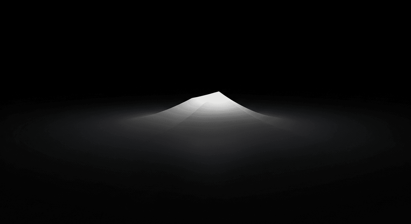
The most common and effective technique for visual elevation in dark mode is through strategic surface color and luminance. Instead of shadows, we use progressively lighter shades of the base dark color to indicate higher elevation. This simulates how objects closer to the viewer often appear brighter. For instance, a base dark mode background might be a very deep gray. A card or panel resting on this would be a slightly lighter shade, and a floating action button or modal dialog, the highest layer, an even lighter gray. This creates clear visual hierarchy. The key is a consistent, carefully chosen luminance scale, ensuring each step is noticeable but not jarring, maintaining the overall dark aesthetic.
Subtle Light Effects and Glows
Beyond surface luminance, subtle light effects and glows can effectively define boundaries and suggest elevation. These simulate how light might catch an object's edges or how an interactive element might emit a faint glow. Consider a very thin, almost imperceptible border in a lighter shade around an elevated component. This outline acts like a subtle highlight. Alternatively, a very soft, diffused inner shadow or a delicate outer glow can create a halo effect, subtly lifting the component. These are especially useful for interactive elements like buttons, where a gentle emanation of light can signify interactivity or a focused state.
The Role of Opacity and Transparency
Opacity and transparency play a nuanced but significant role in conveying depth, particularly for elements that overlay existing content without completely obscuring it. Varying opacity creates a sense of layered space, often seen in transient UI elements like sheets or menus. A semi-transparent background for a modal dialog, for example, allows a hint of the underlying content to show through. This signifies the dialog is a temporary overlay and subtly connects it to the context beneath. For tooltips or snackbars, a slightly reduced opacity combined with a subtle luminance increase effectively communicates their elevated, temporary nature, making them feel lightweight and less intrusive.
Establishing a Clear Elevation Scale
To maintain consistency and predictability in dark mode, establishing a systematic elevation scale is crucial. This scale defines how different UI components are treated across various levels of depth, ensuring users intuitively understand hierarchy and interactivity. A well-defined elevation system is a cornerstone of a robust design system.
- Base Surface: The darkest, foundational background of the application.
- Level 1 Elevation (Low): Slightly lighter than the base. Used for primary content containers like cards, panels, or list items.
- Level 2 Elevation (Medium): Noticeably lighter than Level 1. Applied to secondary interactive elements such as dialogs, side sheets, or expanded navigation menus.
- Level 3 Elevation (High): The lightest and most prominent surfaces. Reserved for high-priority elements like floating action buttons (FABs), critical alerts, or modals.
- Interactive States: Use further subtle luminance shifts or border highlights to indicate hover, focus, or pressed states for elevated components.
- Consistency: Apply these rules uniformly across the entire interface to create a predictable and intuitive user experience.
Practical Tips for Implementation
Effective implementation requires careful attention to detail and thorough testing. Always test your dark mode designs on various screens and in different lighting conditions; what looks good on a calibrated monitor might appear flat or too bright elsewhere. Use a limited, well-defined color palette with sufficient contrast for readability. Establish design tokens for elevation levels for easy adjustments and consistency. Remember, subtlety is key; overdoing luminance shifts or glow effects can make the interface feel heavy or cluttered. The goal is depth that enhances, not overwhelms.
Mastering visual elevation in dark mode is a testament to sophisticated UI design. It moves beyond simply inverting colors, requiring a thoughtful reinterpretation of how depth, hierarchy, and interactivity are communicated. By strategically employing surface luminance, subtle light effects, and a clear elevation scale, designers can create dark mode interfaces that are not only aesthetically pleasing but also highly functional and intuitive.
As dark mode continues to evolve, a deep understanding of these principles will be essential for crafting premium, accessible, and engaging user experiences that truly shine, even in the absence of traditional light.
Sources & Further Reading
- Elevation — Material Design
- Visual Hierarchy — Interaction Design Foundation
- Color theory — Wikipedia