Complex data entry forms are often the unsung battlegrounds of user experience. While glamorous interfaces grab headlines, the reality is that many users spend significant time interacting with forms – applying for loans, setting up accounts, configuring software, or managing extensive profiles. The friction inherent in these interactions, especially when forms are lengthy or unintuitive, doesn't just lead to frustration; it leads to user fatigue, errors, and ultimately, abandonment. For designers and product people, understanding and mitigating this challenge is paramount to successful digital products.
At the heart of user fatigue in forms lies cognitive load – the amount of mental effort required to process information and complete tasks. When a form demands too much from a user's working memory and decision-making capacity, it becomes a draining experience. This article will delve into actionable strategies to systematically reduce cognitive load in complex data entry forms, transforming potential points of friction into streamlined, user-friendly pathways. By applying these principles, you can significantly enhance the user experience, improve data accuracy, and boost completion rates for even the most daunting data entry tasks.
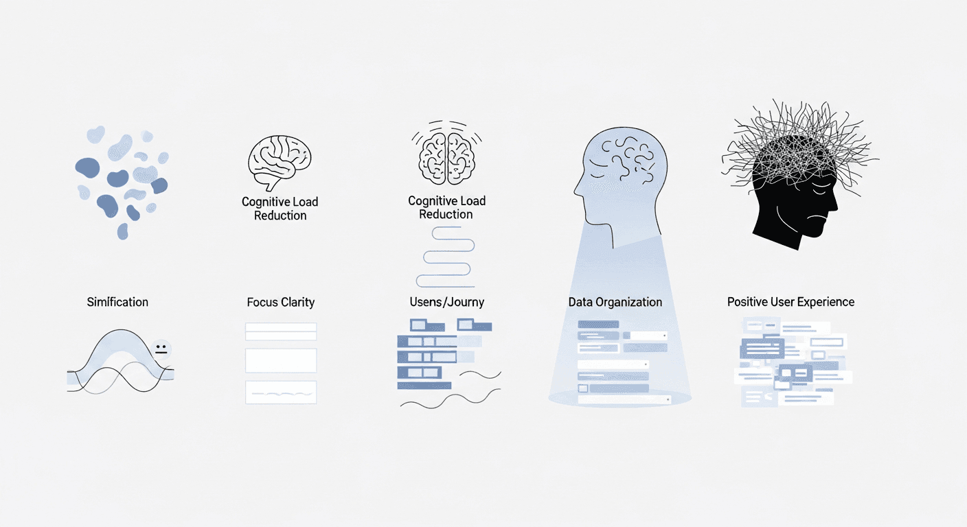
Understanding Cognitive Load in Form Design
Before we can optimize, we must first understand what we're optimizing for. Cognitive load theory identifies three types: intrinsic (inherent difficulty of the task), extraneous (caused by poor design), and germane (effort put into learning and understanding). In form design, our primary target is extraneous cognitive load. This is the unnecessary mental effort users expend trying to decipher confusing instructions, locate fields, remember input rules, or navigate poorly structured layouts. Reducing extraneous load frees up mental resources for the actual task of data entry.
Complex forms are inherently high-load environments because they demand a constant interplay of memory recall, decision-making, and physical input. Users must remember what data to provide, decide how to format it, and then physically type or select information. Each of these steps, if poorly supported by the interface, adds to the mental burden. Imagine a form that asks for an 'ID Number' without specifying which type of ID, or one that uses inconsistent naming conventions for similar fields across different sections – these are classic examples of design choices that increase extraneous cognitive load.
The impact of high cognitive load extends beyond mere inconvenience. It manifests as higher error rates, increased task completion times, elevated user frustration, and ultimately, form abandonment. For businesses, this translates to lost conversions, incomplete data, and increased support costs. Optimizing cognitive load isn't just about making forms 'nicer'; it's about making them more effective and efficient for both users and the business.
Breaking Down Complexity: Chunking and Progressive Disclosure
One of the most effective strategies for managing cognitive load is to reduce the perceived complexity of a form. This can be achieved through two powerful techniques: chunking and progressive disclosure. Chunking involves grouping related information into smaller, more manageable units. Think of how a phone number is chunked into groups of digits (e.g., 555-123-4567) rather than a single, long string. Applying this to forms means organizing fields into logical sections, each with a clear, concise heading.
Progressive disclosure takes chunking a step further by initially hiding advanced, optional, or less frequently used information until the user explicitly requests it. This prevents users from being overwhelmed by too many options at once. For example, an account creation form might initially ask for essential details like name and email, then offer an option to 'Add a profile picture later' or 'Configure advanced privacy settings' once the core task is complete. This approach respects the user's primary goal and reduces the initial mental hurdle.
Practically, this can involve using multi-step wizards for very long processes, where each step focuses on a single chunk of information, or employing accordions and expandable sections for less critical or conditional field groups. The key is to present information in bite-sized pieces, allowing users to focus on one task at a time without being distracted by upcoming or irrelevant fields. Carefully consider the user's journey: what do they absolutely need to know now, and what can wait?
- Group related fields under clear, descriptive headings (e.g., 'Contact Information', 'Billing Address').
- Use visual separators, such as subtle lines or ample whitespace, to reinforce distinct chunks of information.
- Employ accordions or collapsible sections for less critical or advanced settings that users might not need immediately.
- Implement multi-step wizards or paginated forms for extremely long processes, ensuring clear progress indicators.
- Hide optional or conditional fields until their relevance is triggered by a user's previous input.
Visual Hierarchy and Layout: Guiding the Eye
A well-designed visual hierarchy reduces the effort users expend trying to understand the form's structure and what's expected of them. The layout should naturally guide the user's eye through the form, creating a clear and predictable flow. Elements that are more important should stand out more, while less critical information can recede. This includes consistent use of typography, color, and spacing to create distinction and relationships between form components.
Label placement significantly impacts scanning and comprehension. Top-aligned labels are generally fastest for users to complete, as their eyes move efficiently down the form. Left-aligned labels work well for forms where reading speed isn't the absolute priority, allowing more space for field input. Inline labels (placeholders) should be used with extreme caution or as supplementary information, as they disappear upon input and force users to recall what they were supposed to type, increasing cognitive load. Always ensure labels are clearly associated with their respective input fields.
Beyond labels, consider field sizing and alignment. Input fields should be appropriately sized to indicate the expected length of the input (e.g., a short field for a ZIP code, a longer one for an address). Maintain consistent alignment of labels and fields to create a clean, organized appearance. Ample whitespace between sections and fields prevents a cluttered feel, making the form less intimidating and easier to parse. Visual consistency in borders, shadows, and interactive states further reinforces a professional and predictable user experience.
Smart Defaults and Automation: Reducing Input Effort
One of the simplest ways to reduce cognitive load is to minimize the amount of actual input required from the user. Smart defaults and automation play a crucial role here. Pre-filling fields with data you already know about the user (e.g., their name, email, or previously saved address) eliminates typing and recall. For new users, pre-selecting the most common or recommended option as a default can save clicks and decision-making, as long as it's easily changeable.
Beyond pre-filling, leverage automation features like auto-completion and auto-formatting. For instance, when a user starts typing an address, suggest full addresses from a database. Automatically format phone numbers (e.g., adding parentheses and hyphens) or credit card numbers, removing the burden of remembering specific input patterns. These small conveniences add up to a significant reduction in effort and potential errors.
Consider remembering user choices for future interactions, especially for frequently used forms or preferences. If a user always selects 'Ground Shipping,' default to that option next time. The goal is to anticipate user needs and make intelligent predictions based on their behavior or available data, turning tedious input into effortless confirmation whenever possible. However, exercise caution: never default sensitive information or options with significant consequences without explicit user review.
Clear Language and Microcopy: Eliminating Ambiguity
The words you use in a form are just as important as its visual design. Ambiguous or jargon-filled language forces users to pause, interpret, and potentially make incorrect decisions. Labels should be concise, descriptive, and unambiguous. Instead of a generic 'ID Number,' specify 'Social Security Number' or 'Passport ID.' Use action-oriented language for buttons, like 'Submit Application' instead of just 'Submit' or 'Continue to Payment' rather than 'Next'.
Microcopy – the small bits of text that guide users, provide context, or offer instructions – is incredibly powerful. Helper text placed below a field can clarify complex input requirements (e.g., 'Password must be at least 8 characters, with one uppercase, one lowercase, and one special character'). Tooltips can provide additional context for less common fields without cluttering the primary interface. Ensure all microcopy is written in plain language, avoids technical terms, and directly addresses potential user questions.
Even the absence of words can cause friction. Ensure every interactive element has a clear purpose and label. If a field has specific formatting requirements, state them explicitly. If a choice has implications, explain them concisely. Good microcopy anticipates user questions and answers them proactively, reducing the mental gymnastics required to complete the form successfully.
Real-time Validation and Feedback: Preventing Errors
Nothing increases cognitive load and frustration more than completing a long form only to be met with a list of errors after submission. Real-time validation provides immediate feedback as the user types, allowing them to correct errors instantly before moving on. This 'fail fast' approach prevents larger problems later and reduces the memory load of tracking multiple errors.
When an error occurs, the feedback must be clear, concise, and actionable. Don't just say 'Invalid Entry.' Instead, specify 'Email address format is incorrect (e.g., user@example.com)' and ideally, highlight the problematic field. Error messages should be placed directly next to the field they refer to, not at the top of a long form, forcing users to scroll to find the issue. Use clear visual cues (e.g., red borders, error icons) to draw attention without being overly aggressive.
Equally important is positive feedback. As users successfully complete sections or meet validation criteria, subtle visual cues (e.g., a green checkmark) can reassure them and reduce anxiety. For multi-step forms, clear progress indicators (e.g., 'Step 3 of 5') provide a sense of accomplishment and manage expectations about the remaining effort. Providing timely, constructive feedback builds confidence and reduces the mental burden of uncertainty.
Handling Optionality and Conditionality Gracefully
Complex forms often contain optional fields or sections that only appear based on previous selections. Managing these gracefully is crucial to avoid overwhelming users or creating confusion. Clearly distinguish between required and optional fields. The common convention is to mark required fields with an asterisk (*) and provide a legend, or explicitly state '(optional)' next to optional fields. Avoid making too many fields required; every required field is another hurdle for the user.
Conditional logic, while powerful for personalizing forms, must be implemented smoothly. When fields dynamically appear or disappear, the transition should be seamless, not jarring. Ensure that the layout doesn't shift dramatically, causing users to lose their place. For example, if selecting 'Yes' to 'Do you have a pet?' reveals a 'Pet's Name' field, it should appear immediately below the question in a clear, consistent manner.
Design for clarity in conditional flows. If a section is removed due to a user's choice, ensure that any implications are clear. For instance, if choosing 'No' to 'Are you a current customer?' removes a 'Customer ID' field, the user should implicitly understand why that field is no longer relevant. Avoid creating dead ends or situations where users are unsure why certain options are unavailable or why the form suddenly changed.
Measuring and Iterating: User Testing and Analytics
Even with the best intentions and adherence to best practices, assumptions about user behavior can lead to overlooked friction points. The only way to truly understand where users struggle and where cognitive load is highest is through rigorous user testing and data analysis. Observe actual users interacting with your forms. Pay close attention to moments of hesitation, rereading, or explicit confusion. Are they struggling with a particular label? Are they unsure about a required format? These qualitative insights are invaluable.
Supplement qualitative testing with quantitative analytics. Track key metrics such as form completion rates, abandonment points, time taken to complete the form, and common validation error types. A high error rate on a specific field, or a significant drop-off at a particular step, points directly to areas of high cognitive load or confusion. A/B testing different versions of labels, field groupings, or validation messages can help you objectively determine which designs perform better.
Form optimization is not a one-time task; it's an ongoing process of iteration. Gather feedback, implement changes, measure the impact, and repeat. As user needs evolve and products mature, forms will inevitably need adjustments. A commitment to continuous improvement, driven by data and user insights, ensures that your forms remain efficient and user-friendly over time.
- Conduct usability testing to observe users interacting with forms and identify points of friction.
- Track form completion rates and identify specific steps or fields where users frequently abandon the process.
- Monitor the average time taken for users to complete various forms or form sections.
- Analyze logs for common validation errors, indicating unclear instructions or problematic input expectations.
- Utilize heatmaps and session recordings to understand user interaction patterns, cursor movements, and areas of hesitation.
- A/B test different design elements like label placement, microcopy, or field organization to measure their impact on completion and error rates.
Key Takeaways for Form Optimization
Optimizing cognitive load in complex data entry forms is a critical skill for any designer or product manager. It moves beyond aesthetics to fundamentally improve the utility and usability of your digital products. By systematically applying strategies such as chunking information, guiding users with clear visual hierarchies, leveraging smart defaults, crafting unambiguous microcopy, providing real-time feedback, and managing optionality with care, you can significantly reduce user fatigue and enhance the overall experience.
Remember, the ultimate goal is to make the user's journey as effortless and error-free as possible. Every design decision, from the choice of a label to the flow of a multi-step process, should be scrutinized through the lens of cognitive load. Continuously test, measure, and iterate. A well-optimized form isn't just a functional necessity; it's a testament to user-centric design that respects users' time and mental energy, fostering trust and encouraging successful interactions.
Sources & Further Reading
- Cognitive load — Wikipedia
- Cognitive Load Theory: Reducing the Burden on Users — Interaction Design Foundation
- Error Prevention — Nielsen Norman Group
- <input>: The Input (Form Input) element — MDN Web Docs
- Progressive Disclosure — Interaction Design Foundation