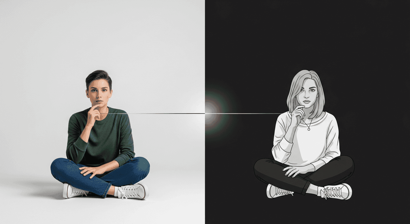
In the complex landscape of digital interfaces, users are constantly bombarded with information. From navigation menus and calls to action to intricate content layouts, every element vies for attention. Without a clear guide, users can quickly become overwhelmed, leading to frustration and abandonment. This is where visual hierarchy steps in as a fundamental principle of UI design, acting as the invisible hand that directs the user's eye and mind through an interface.
Visual hierarchy is more than just making some elements bigger or brighter; it's a strategic approach to organizing and presenting information in a way that reflects its importance and guides users through a logical flow. By intentionally structuring visual elements, designers can ensure that critical information is seen first, primary actions are easily identifiable, and the overall experience feels intuitive and efficient. Mastering visual hierarchy is key to crafting interfaces that are not only aesthetically pleasing but also highly usable and effective.
What is Visual Hierarchy?
At its core, visual hierarchy is the arrangement or presentation of design elements in a way that implies their order of importance. It's about influencing the sequence in which the human eye perceives what it sees. In UI design, this means ensuring that the most critical information or actions on a screen are the first to capture a user's attention, followed by secondary and then tertiary elements. This deliberate ordering helps users quickly understand the purpose of a page, find what they need, and complete tasks without unnecessary effort.
A well-established visual hierarchy reduces cognitive load by pre-processing information for the user. Instead of having to consciously decide where to look next, their eyes are naturally drawn through the interface in a logical progression. This contributes significantly to a smoother, more efficient, and ultimately more satisfying user experience, transforming a potentially chaotic display into a clear, navigable path.
Core Principles of Visual Hierarchy
Designers employ several fundamental principles to establish and control visual hierarchy. These principles, when applied thoughtfully, allow for the creation of interfaces where information flows naturally and key elements stand out. Understanding how each principle influences perception is crucial for effective UI design.
- Size: Larger elements naturally draw more attention than smaller ones. Headlines are typically larger than body text, and primary call-to-action buttons are often larger than secondary actions.
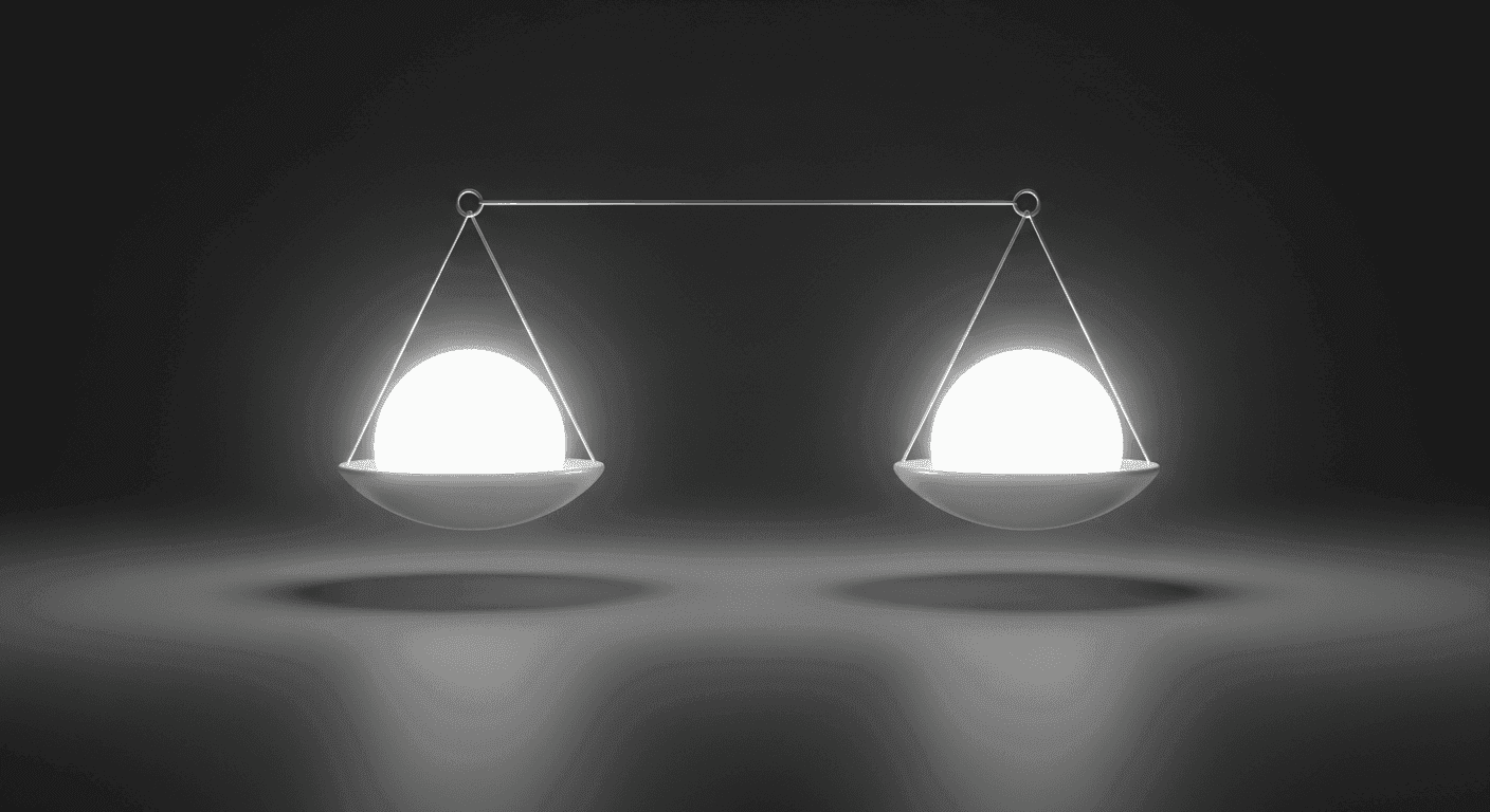
- Color and Contrast: Bright, saturated colors or colors that strongly contrast with their background tend to stand out. A distinct color can highlight important information or actionable items, while muted tones can recede into the background.
- Typography: Variations in font size, weight (boldness), style (italic, regular), and typeface can differentiate elements. Heavier or more unique fonts often signal importance, while lighter, standard fonts convey less emphasis.
- Spacing and Proximity: Elements that are closer together are perceived as related, while ample whitespace around an element can make it stand out and appear more significant. Proper spacing prevents clutter and improves readability.
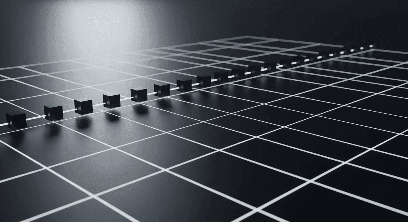
- Placement and Layout: The position of an element on a screen can influence its perceived importance. Users in Western cultures typically scan from top-left to bottom-right (following F-patterns or Z-patterns), making elements placed in these areas naturally more prominent.
- Repetition and Consistency: Repeating visual styles for similar types of information or actions reinforces their relationship and helps users quickly identify patterns and understand the interface.
These principles are rarely used in isolation. Instead, they are combined and layered to create a rich tapestry of visual cues that guide the user's journey. For example, a primary button might be larger, brightly colored, placed prominently, and surrounded by whitespace to maximize its visual weight and ensure it's the first thing a user sees and interacts with.
Applying Visual Hierarchy in UI Design
Implementing visual hierarchy effectively requires a clear understanding of content priority and user goals. Before designing, identify the absolute most important information or action on a given screen. Is it a product image, a “Buy Now” button, a headline, or a critical alert? Once identified, use the principles of hierarchy to elevate these elements above all others. This might mean making a headline significantly larger, using a vibrant color for a primary call to action, or ensuring ample whitespace around a key piece of information.
Consider the user's journey through the interface. For an e-commerce product page, the visual hierarchy might guide the user from the product image and title, to the price, then to the “Add to Cart” button, and finally to product details and reviews. In a form, the hierarchy would lead them through input fields in a logical order, highlighting required fields and the submission button. Every screen should have a primary focus, supported by secondary information, and tertiary details that are accessible but not distracting.
Benefits of a Well-Executed Visual Hierarchy
The strategic application of visual hierarchy yields significant benefits for both users and product owners. Foremost among these is improved usability and learnability. When an interface clearly communicates what's important and how to interact with it, users can accomplish their goals more quickly and with less frustration. This leads to increased efficiency and a more positive overall experience.
Furthermore, a strong visual hierarchy enhances user engagement and reduces cognitive load. Users are more likely to explore and interact with an interface that feels organized and easy to navigate. By reducing the mental effort required to process information, designers can keep users focused on their tasks rather than struggling to understand the interface itself. This clarity also leads to more effective communication, ensuring that key messages and calls to action are not missed, which can directly impact conversion rates and user satisfaction.
Testing and Refining Visual Hierarchy
Visual hierarchy is not a static concept; it's an iterative process that benefits immensely from testing and refinement. What seems clear to a designer might not be clear to a user, whose mental models and expectations can vary widely. User testing sessions, where participants are asked to complete tasks while their interactions are observed, are invaluable for identifying areas where the hierarchy might be confusing or ineffective.
Quantitative methods like A/B testing can help determine if changes to size, color, or placement of key elements lead to better outcomes, such as higher click-through rates or reduced task completion times. Eye-tracking studies, though often more specialized, can provide direct insights into where users are looking and in what sequence. Continuously gathering feedback and iterating on design choices ensures that the visual hierarchy remains optimized, adapting to user needs and evolving content priorities over time.
In essence, visual hierarchy is a powerful tool that, when wielded skillfully, transforms a collection of UI elements into a cohesive, intuitive, and highly effective user experience. It's about respecting the user's attention and guiding them with purpose, making every interaction smoother and more meaningful.
Sources & Further Reading
- F-Shaped Pattern for Reading Web Content — Nielsen Norman Group
- Visual Hierarchy: The Cornerstone of Good Design — Interaction Design Foundation
- Gestalt Principles of Perception — Interaction Design Foundation
- Visual hierarchy — Wikipedia