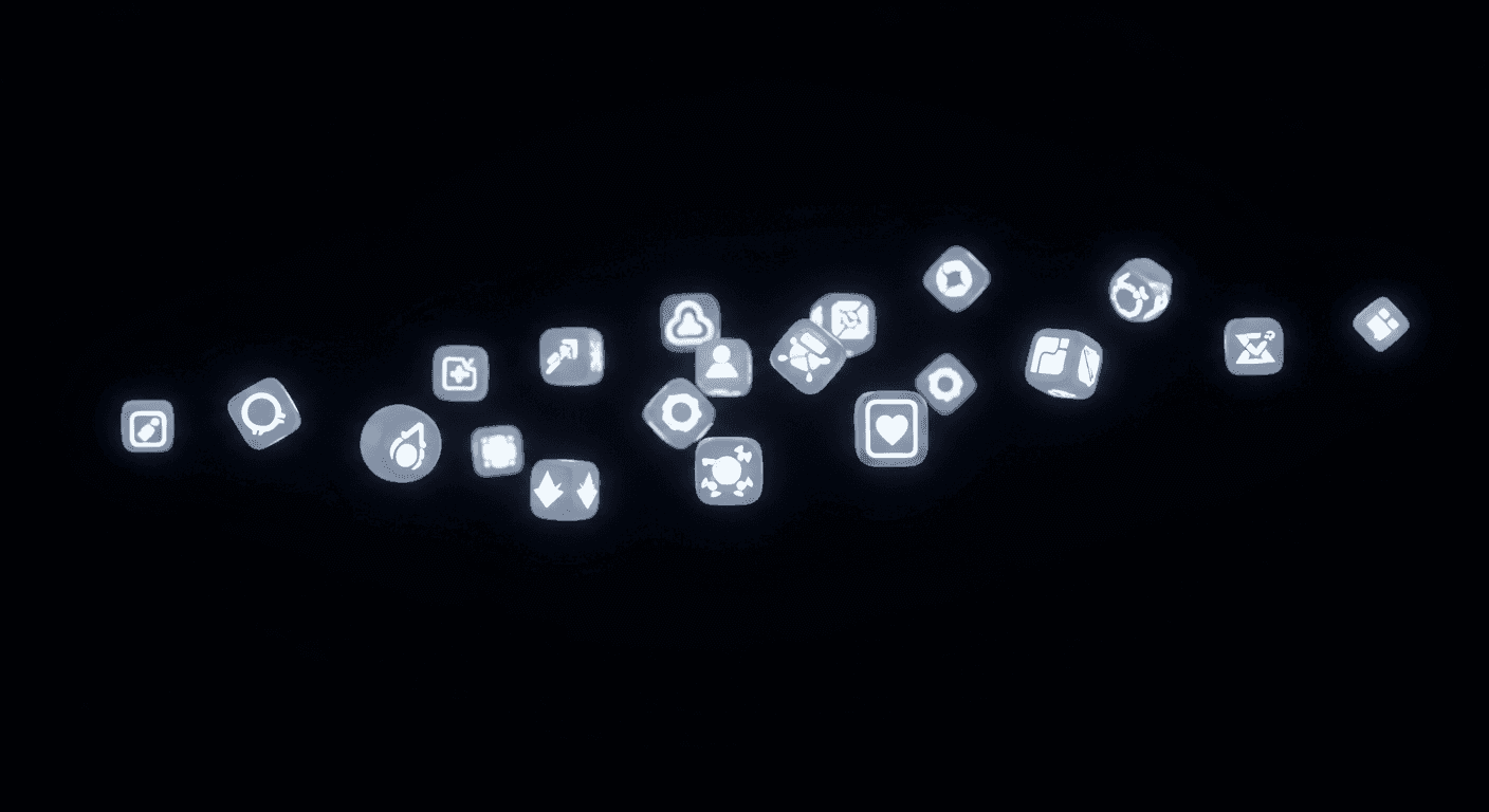
Dark mode has become a fundamental user expectation, driven by preferences for reduced eye strain and extended battery life. For designers, integrating dark mode is a nuanced challenge beyond simple color inversion. Icons, small but critical navigational cues, are particularly susceptible to losing visual impact and legibility if not properly adapted.
Achieving visual cohesion across light and dark themes is paramount for a seamless user experience. Inconsistent or indiscernible icons in dark mode disrupt flow and undermine design quality. This article guides you through essential considerations for crafting icons that perform effectively, ensuring clarity, meaning, and aesthetic harmony in any theme.
The Dark Side of Iconography: Why It Matters
Dark mode fundamentally alters visual hierarchy and element perception. What works on a light canvas, where elements recede, can clash or disappear on a dark one. Icons, relying heavily on contrast and shape, are at the forefront. A crisp light-mode icon might become a faint blur against a dark background if not re-evaluated.
The core issue stems from how our eyes perceive light and dark. In low light, pupils dilate, making fine details and low-contrast elements harder to discern. Icons designed without dark mode in mind often fail to provide clarity and readability, leading to a diminished user experience.
Mastering Color and Contrast for Dark Mode Icons
Direct color inversion is the most common pitfall in dark mode icon design. Simply swapping black for white rarely yields optimal results. A strategic approach to color and contrast is essential. Icons must remain visible and distinct without becoming overly bright or distracting, which can be equally detrimental.
When selecting colors, focus on reducing luminance while maintaining sufficient contrast. Pure white icons can create a harsh halo effect, causing eye strain. Opt for slightly desaturated colors, off-whites, or light grays. These softer tones provide legibility without overwhelming the user's eyes. Contrast is about both light-dark and color differentiation.
- Avoid pure white (#FFFFFF); use a soft off-white or light gray (e.g., #E8E8E8) for primary elements.
- Apply desaturated brand colors to appear softer against dark backgrounds.
- Ensure interactive icons meet accessibility contrast ratio (typically 4.5:1).
- Consider ambient light; an icon fine in daylight might be too dim in a dark room.
- Test icon colors with surrounding UI for harmonious integration.
Adapting Icon Styles: Strokes, Fills, and Forms
The fundamental style of your icons is crucial. Outline icons, popular for minimalism in light mode, can appear too thin, fragile, or even disappear on a dark surface. Thin strokes often lack sufficient visual weight or contrast.
Consider adapting the icon style with subtle adjustments. A thin outline might benefit from a thicker stroke, or a shift to a filled or dual-tone version could enhance its presence. Adding a very subtle inner shadow or delicate gradient can give a filled icon more depth. Maintain the icon's core shape and meaning, evolving its visual presentation for the new context.
Maintaining Semantic Consistency and Recognition
Beyond aesthetics, an icon's primary purpose is efficient communication. In dark mode, visibility isn't enough; icons must retain immediate recognizability and semantic consistency with their light-mode counterparts. Users shouldn't have to re-learn what an icon represents when the theme changes.
Preserve the core visual metaphor and overall shape. While colors, stroke weights, or fills might adjust, fundamental elements conveying meaning should remain intact. A 'gear' icon for settings must still resemble a gear; a 'play' icon unmistakably look like a play symbol. Consistency across your icon library ensures intuitive navigation regardless of theme.
Practical Tips for Implementation and Testing
Designing for dark mode is an iterative process, heavily reliant on thorough testing. It's insufficient to design icons in isolation; view them within the full dark mode interface context. Observe how they interact with surrounding text, buttons, and UI elements. Are they balanced? Do they command appropriate attention?
Always test dark mode icons on actual devices and across different screen types (e.g., OLED vs. LCD), as color and contrast vary. Observe appearance in varied lighting – from bright daylight to a dimly lit room. Crucially, solicit user feedback. Real-world experiences reveal hidden usability issues, allowing refinement for a truly cohesive dark mode experience.
Sources & Further Reading
- SVG — MDN Web Docs
- The Ultimate Guide to Design Systems — Interaction Design Foundation
- Visual Hierarchy: Organizing Content to Guide Users — Interaction Design Foundation