User expectations for personalized experiences are higher than ever. Beyond content and features, visual design, particularly color, plays a crucial role. Static color palettes, while consistent, often miss opportunities to connect with users on a deeper, more personal level.
Adaptive color palettes offer a powerful solution. They allow interfaces to dynamically adjust their visual appearance based on user preferences, context, or even system conditions, creating a more intuitive and engaging experience. This article explores how to design and implement such palettes effectively.
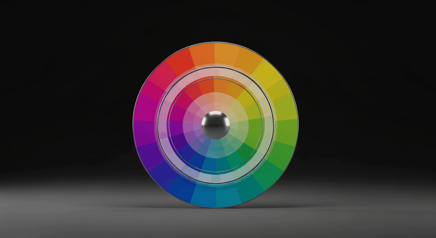
What Are Adaptive Color Palettes?
An adaptive color palette is a set of colors that can change or adjust based on predefined rules or real-time conditions. Unlike a fixed palette, which uses the same colors across all scenarios, an adaptive palette introduces flexibility, allowing the UI to respond intelligently to the user's environment or choices.
This adaptability can manifest in various ways: switching between light and dark modes, incorporating brand colors from dynamic content, or even subtly shifting hues to reflect a user's mood or preferred theme. The goal is to enhance the user experience by making the interface feel more responsive and tailored.
Why Adopt Adaptive Colors? The UX Benefits
The primary driver for adaptive color palettes is improved user experience. By offering visual personalization, you empower users and make them feel more in control. This can lead to increased satisfaction and engagement, as users appreciate interfaces that cater to their individual needs and preferences.
Beyond personalization, adaptive colors significantly boost accessibility. Dark modes reduce eye strain, especially in low-light conditions or for users with light sensitivity. Customizable themes can cater to users with various visual impairments, offering higher contrast options or specific color combinations that are easier to perceive, thus making your product usable by a wider audience.
They also support contextual relevance. Imagine a music app whose primary accent color subtly shifts to match the album art currently playing, or a productivity app that changes its theme based on the time of day to indicate focus or winding down. These subtle cues create a more immersive and less jarring experience, making the interface feel 'smarter' and more integrated with the user's current situation.
Key Principles for Designing Adaptive Palettes
Designing adaptive palettes requires careful planning to maintain consistency and usability. Start with a robust core palette that defines your brand's foundational colors. These are your non-negotiables, providing a stable anchor for any adaptations and ensuring brand identity is never lost, regardless of the theme or context.
Define clear rules and parameters for adaptation. What triggers a change? Is it a user setting, a system preference, or dynamic content? Document these conditions thoroughly to ensure consistency and predictability across your product. Think deeply about color relationships: how do primary, secondary, and accent colors transform relative to each other within different adaptive themes?
Prioritize accessibility from the outset, not as an afterthought. Ensure that even with adaptations, your color contrasts meet WCAG (Web Content Accessibility Guidelines) standards. Provide sufficient options for users to customize their experience without compromising usability, allowing them to choose themes that work best for their visual needs.
Implementing Adaptive Color Systems
Building an adaptive color system often involves using design tokens. Design tokens are a single source of truth for your design system, representing design decisions like color values, typography scales, and spacing. Instead of hard-coding hex values directly in your code or design files, you reference these abstract tokens (e.g., `color-primary-default`, `color-background-dark`).
When a condition changes (e.g., a user switches to dark mode), your system updates the underlying hex values associated with these tokens. Because your UI components reference the tokens, they automatically reflect the new palette, ensuring widespread, consistent updates with minimal effort. This approach makes managing complex color variations scalable and highly maintainable across large projects.
- Define Core Semantic Roles: Instead of literal color names like `blue-500`, use semantic roles such as `color-background-primary`, `color-text-body`, or `color-interactive-primary`. This abstracts the color from its specific value.
- Establish Theme Variables: Create distinct sets of token values for each theme you support (e.g., `theme-light`, `theme-dark`, `theme-high-contrast`). Each theme would map its own hex values to the semantic roles.
- Implement a Switching Mechanism: Provide clear UI controls for users to select their preferred theme, or detect system preferences automatically (like operating system dark mode settings) to apply the appropriate palette.
- Test Across Conditions: Rigorously test your adaptive palette in various scenarios and devices to catch any contrast issues, legibility problems, or unexpected visual behaviors before deployment.
- Document Everything: Maintain clear, comprehensive documentation on color usage, token definitions, and adaptation rules for your design and development teams to ensure consistent application and future scalability.
Common Pitfalls and Best Practices
One common pitfall is over-adaptation, leading to a chaotic or inconsistent user experience. Not every UI element needs to change dynamically. Focus on key elements where adaptation provides genuine value, such as backgrounds, primary text, and interactive components, to avoid visual noise and maintain a sense of stability.
Another challenge is maintaining brand identity. While adapting, ensure the core essence of your brand's visual language remains intact. The adaptations should feel like variations of the same brand, not entirely different entities. Consistent use of primary brand colors or specific visual motifs can help ground the adaptive experience.
Always validate your adaptive choices with user testing. What seems logical in design might not translate well to actual users. Gather feedback on different themes and adaptive behaviors to refine your palettes and ensure they truly enhance personalization and usability for your target audience, rather than creating confusion or frustration.
In an increasingly personalized digital landscape, static color palettes are becoming a relic of the past. Designing adaptive color palettes isn't just about aesthetics; it's about creating more accessible, engaging, and deeply personal user experiences. By embracing thoughtful adaptation, robust system design, and continuous user validation, designers can craft interfaces that truly resonate with every individual, making digital interactions more intuitive and enjoyable.
Sources & Further Reading
- Media queries — MDN Web Docs
- User Interface (UI) Design — Interaction Design Foundation
- Using CSS custom properties (variables) — MDN Web Docs
- prefers-color-scheme: Hello darkness, my old friend — web.dev
- Color theory — Wikipedia