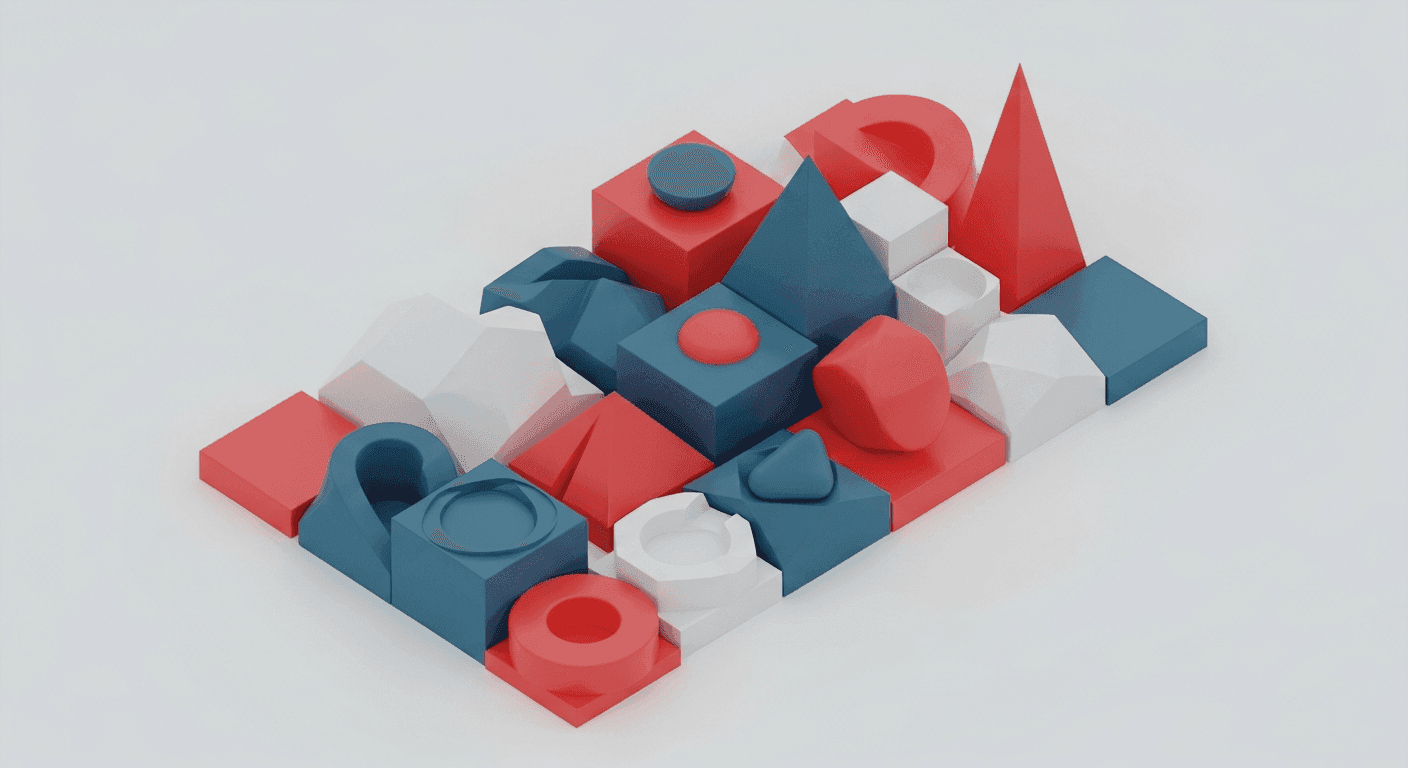
In today's digital landscape, users are constantly bombarded with information. The challenge for designers isn't just presenting data, but making it immediately understandable and not overwhelming. Poorly managed information density quickly leads to cognitive overload, user frustration, and abandonment. This is where strategic visual hierarchy becomes an indispensable tool.
Visual hierarchy is the art and science of arranging elements to imply importance, order, and relationship. It guides the user's eye, ensuring they see crucial information first, then supporting details. By mastering information density through effective visual hierarchy, designers transform cluttered interfaces into intuitive, user-friendly experiences that enhance comprehension and engagement.
The Core Problem: Overwhelming Information
Imagine a wall of text or a dashboard with equally prominent charts. Your brain struggles to decide where to look, what's important, and how pieces relate. This is cognitive overload—when mental effort exceeds a user's capacity. In UI design, high information density without clear hierarchy leads to poor user experience, as users feel lost or give up.
The goal isn't to reduce information amount, but perceived effort to process it. Users often need extensive data, but require a clear path to navigate complexity. Visual hierarchy acts as that intelligent guide, helping users efficiently scan, understand, and interact without feeling overwhelmed.
What is Visual Hierarchy? (And Why it Matters)
At its heart, visual hierarchy makes certain elements stand out, creating a clear order of importance. It’s the subtle manipulation of visual properties to tell a story about content—what’s primary, secondary, and tertiary. A well-established hierarchy ensures users instinctively grasp critical information first, even at a glance.
Benefits extend beyond aesthetics. Strong visual hierarchy reduces cognitive load, making information easier to digest. It improves usability by making interfaces more scannable and navigable, and enhances accessibility. Ultimately, it leads to better user engagement and task completion, as users quickly find what they need and understand interaction.
Key Principles for Establishing Hierarchy
Designers employ fundamental principles to create effective visual hierarchy. Applied thoughtfully, these control attention, direct focus, and organize information into digestible chunks. Mastering their application is crucial for managing information density.
- Size: Larger elements draw more attention. Use size to indicate importance, like headlines or prominent call-to-action buttons.
- Color and Contrast: Bright, saturated, or contrasting colors stand out. Reserve high-contrast colors for critical elements demanding immediate focus.
- Proximity and Spacing: Elements placed close together are perceived as related. Ample white space around elements reduces clutter and makes them stand out.
- Alignment: Consistent alignment creates order and makes an interface feel organized and professional, guiding the eye.
- Repetition: Repeating visual elements (fonts, colors, styles) creates consistency and signals relatedness, helping users learn patterns.
- Position: Elements in expected or prominent positions (e.g., top-left for primary navigation) naturally receive more attention.
Each principle can be used individually or in combination. A small, brightly colored icon might draw as much attention as a large, subdued text block. Intentionality and understanding how elements interact to guide user perception are key.
Practical Application: Guiding the User's Eye
Applying these principles means deliberate choices for every screen element. On a product page, the image and price might be large and central, while customer reviews are smaller but grouped below. A primary "Add to Cart" button would use a high-contrast color and be prominently sized, standing out from "Add to Wishlist."
For forms, required fields might have a distinct visual indicator (e.g., an asterisk in a contrasting color) and a bolder label. Error messages need immediate attention, often displayed in red with clear text and an icon, for instant understanding. For complex dashboards, varying font weights, colors, and card structures delineate data sets, allowing users to scan for summaries.
Iteration and Testing: Refining Your Hierarchy
Designing with visual hierarchy is an iterative process. What's clear to you might not be obvious to users. Eye-tracking, A/B testing, and usability tests are invaluable for validation. Observe where users' eyes go, what they miss, and where they get stuck.
Pay attention to feedback. If users struggle to find key information or overlook calls to action, your hierarchy needs refinement. Small adjustments—font weight, color shift, or increased white space—can profoundly impact how easily users navigate and understand your interface. Continuous testing ensures effective information density management.
Structuring information density through visual hierarchy is more than aesthetics; it's about making designs work better. By thoughtfully applying principles like size, color, proximity, and alignment, designers transform overwhelming interfaces into intuitive, efficient, and enjoyable experiences. It’s about respecting user attention, minimizing cognitive load, and guiding them effortlessly. Master visual hierarchy, and you master the flow of information, empowering users to achieve goals with clarity and confidence.
Sources & Further Reading
- Cognitive load — Wikipedia
- Gestalt Principles — Interaction Design Foundation
- Usability — Wikipedia